BILT Credit Card Website
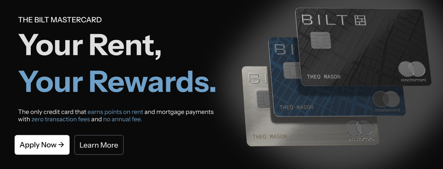
A promotional website prototype designed to introduce users to the BILT Credit Card, the only card that earns rewards on rent and mortgage payments.
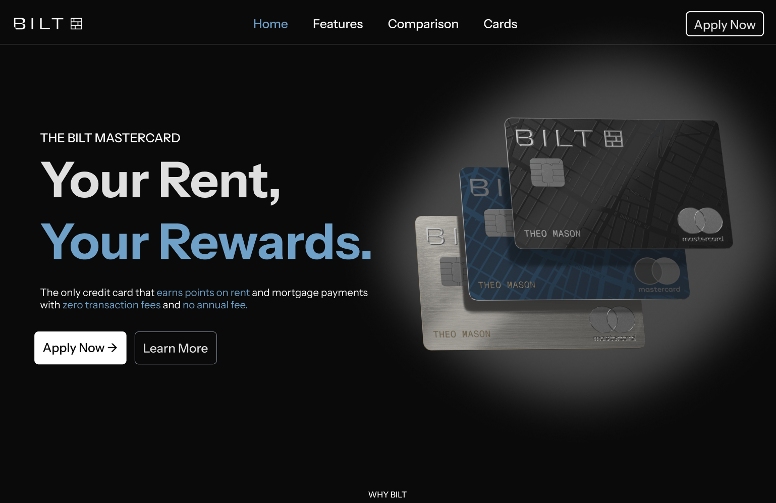
A promotional website prototype designed to introduce users to the BILT Credit Card, the only card that earns rewards on rent and mortgage payments.
I designed an informational website prototype that teaches users about the BILT Credit Card while applying UI design principles.
The site explains how users can earn rewards on rent and mortgage payments, organized across five clear pages:
My goal was to make the site feel clean, premium, readable, and easy to scan. Each design choice supports quick understanding instead of overwhelming the user.
I started with a project proposal that mapped specific UI principles to moments in the website. This helped guide the structure before designing the prototype.
 View Project Proposal
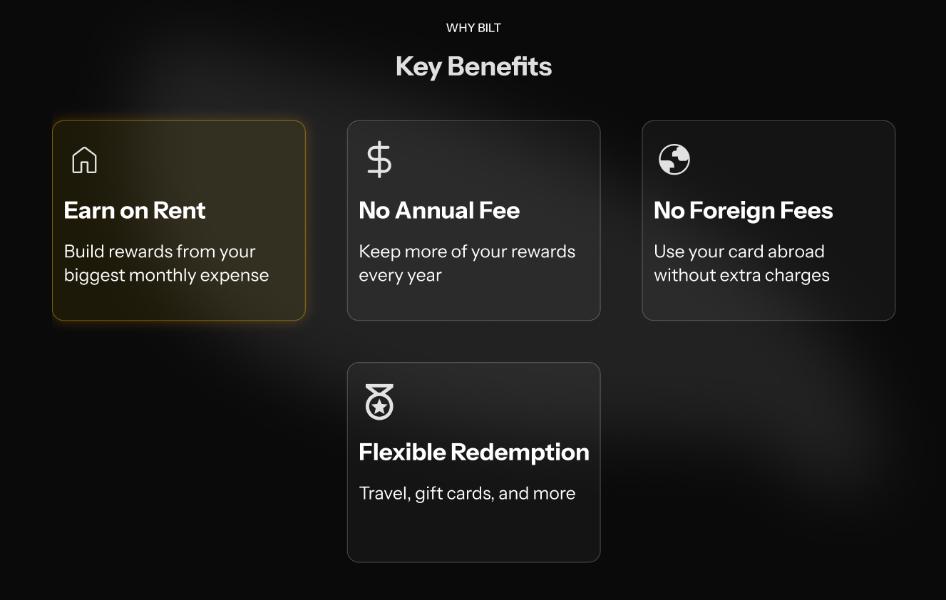
When similar items are grouped together, the item that looks different is more likely to stand out and be remembered.
I used this in the benefits grid by highlighting the Earn on Rent card in gold. This makes BILT's most unique feature the first thing users notice.
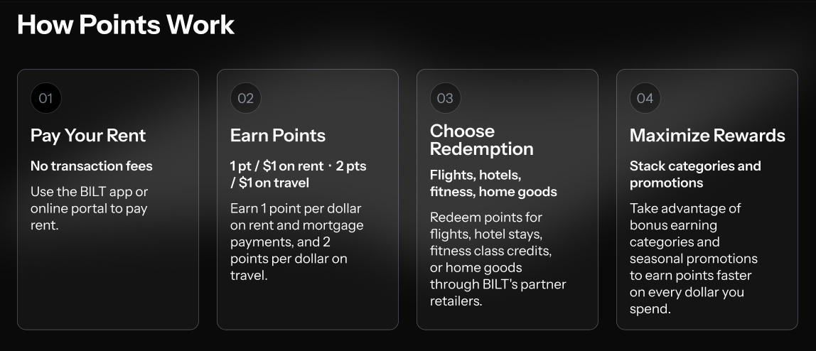
Chunking breaks information into smaller groups so users can understand it without feeling overwhelmed.
I separated the card information across five pages and used smaller sections within each page. The earning process is shown as step cards so users can follow one idea at a time.
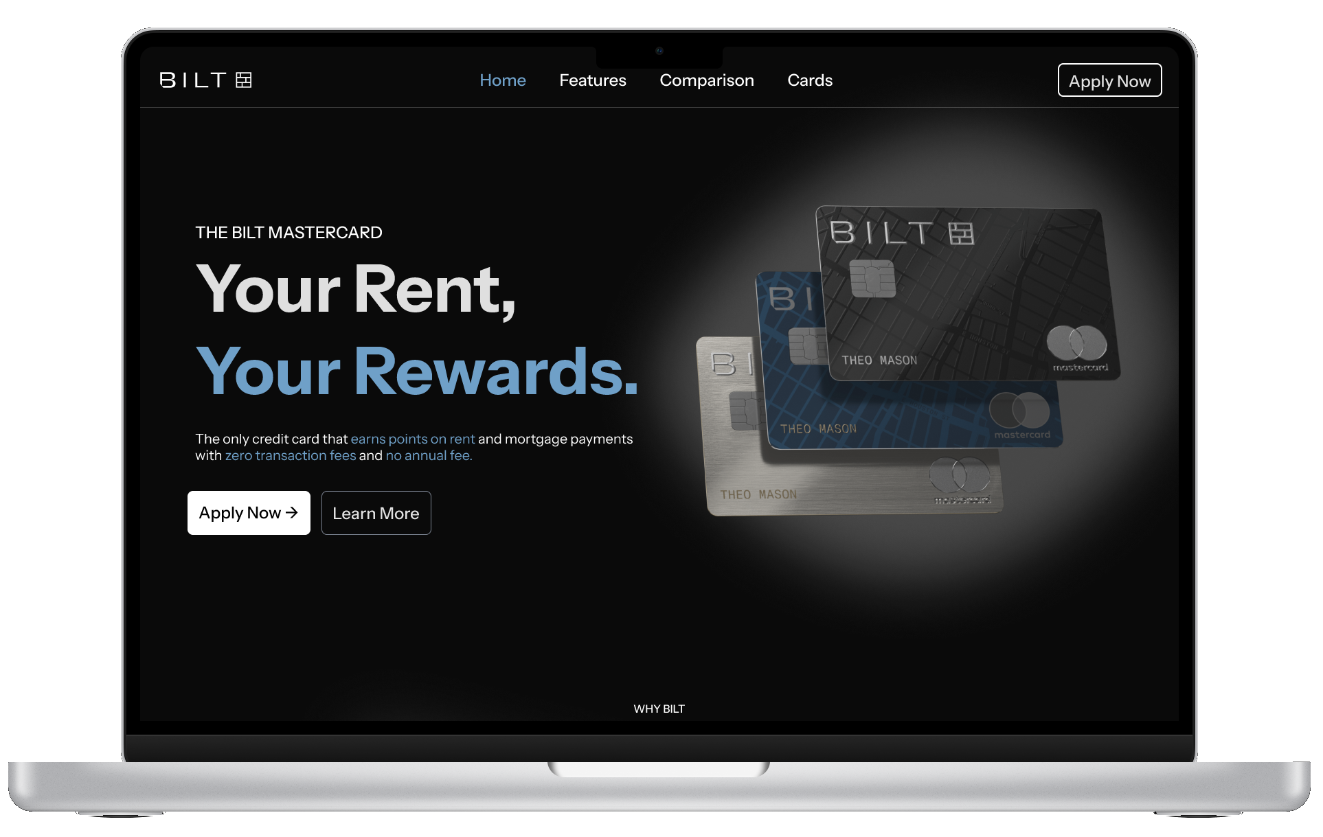
Fitts's Law explains that larger, closer targets are faster and easier for users to click.
I made the Apply Now button large and visually clear so users can find and click it quickly. It stays consistent across the site to reduce searching.
The final prototype is a five-page promotional website that takes users from learning the card benefits to comparing options and applying.
This project showed me that design goes beyond aesthetics. Strong design also depends on structure, hierarchy, usability, and memory. The hardest part was applying several principles while keeping the site clean and premium. I learned that the best design decisions often feel natural because they effortlessly support the user.